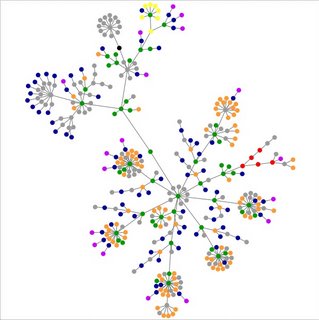
Someone passed along a cool web tool that depicts your website as a graphic representation of links, hubs, etc. Here's the website. For whatever reason, Liminal Me is an extensive network. See:

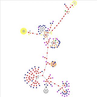
For comparison's sake, here is the University of British Columbia site, www.ubc.ca:

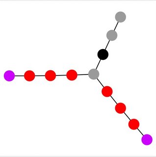
A little more understandable and much more reasonable is the website Rocco and I are developing, which has yet to be released to the public:

Have no fear, dear reader, I will announce its release all in good time. The website has been a project in development for ages now, and hopefully this summer we will finally get around to producing something interesting, or at the very least entertaining.
What I find fascinating but know nothing about is how the structure of a site represented this way reveals the quality of its design. Someone with a trained eye could analyse these images and dub one site vastly better than the other for navigational and/or informational purposes. I think, perhaps, off the top of my head, like, that the website might win for simplicity of design, but not for elegance. You just wait. We'll post and host so much fabulous stuff there that its graphic representation will astound even me.
that's really cool! Thanks for posting that!
ReplyDelete